
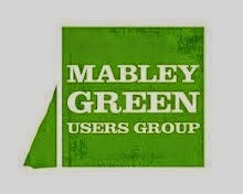
An odd thing about the B&Q grant we applied for (and got - yessss!) is that you have to send them a letter on headed paper from your organisation. But the Mabley Green Users Group didn't have anything like that. So I again engaged the services of the generous Si, and we got to work creating a logo together. So here's what we came up with.
The idea behind it is that it's a stylised map of Mabley Green, with a big square bit (the main part of the park) and a little triangular part along the side (where the meadow will be). I'm really pleased with it. What do you think?

Hi Si & Chris - I think the new logo is brilliant! Sort of - 'Don't forget this triangle on the side - it's just as important!'
ReplyDeleteI reckon you guys should knock together some signs of the logo - and stake them into interesting corners of the meadow - with the relevant info: poppies, bug hotel, juniors first steps taken on a pinic, etc.
Great design Si.
Now how about re-branding more parts of The Wick?